Health & Beauty Package Label Design
Two lucrative consumer markets that many companies try to capitalize on is the health and beauty sectors. While these markets present a huge opportunity for companies, they are also very competitive. You have to invest a lot of time, money, and energy into advertising, marketing, and branding.
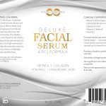
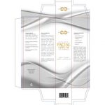
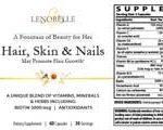
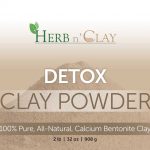
While companies make sure that they invest enough in these areas of their business, a good number of them overlook the selling power of design. It’s often the health beauty package design that draws in consumers. The design is what initially captures the attention and get products considered for the purchase decision.
Why Having the Right Packaging and Label Design is So Essential for Health and Beauty Products
Whether you’re selling in the retail environment, eCommerce platforms, or both, you have to understand how consumers make buying decisions. They are always comparing different products for the specific type of product they are looking for. The health beauty package design is what usually draws their attention.
Once their attention is captured, they’ll start to read the copy and information on the package and labels. This is where you’ll be selling them on the benefits of your product. You have to understand that they may have never considered your product if it didn’t have an attractive and compelling package design.
What Characteristics Makes for a Winning Package Design?
There are several characteristics that make. for a winning package design. It’s not enough to only have one or two of them. Here are the characteristics of winning package designs:
1. Relevance
Is the design relevant to the benefits your customer is looking for? If the ingredients in the particular supplement offer many heart health benefits, does the healthy product label design covey this through imagery? You might see things like the health and heart symbol, stethoscope, and the actual organ.
For a dog supplement, you may see a happy and active dog. The point is that the design must communicate “this product is for you if you’re looking for x benefit or want to solve y problem.” In some cases, the design can even convey the benefits of the product that you can’t legally state in the copy.
2. Appeal
The appeal of your product is very important when it comes to beauty product label design. For example, the design of the package can communicate many things. It can convey the quality of the product, the innovative ingredient/feature/technology, the exclusivity, and other things that make the product appealing.
When you look at many high-end beauty products, you’ll notice that the beauty product label design conveys luxury, exclusivity, and uniqueness. The design is usually classy or avante garde. This is because the package has a role to play in communicating the product’s value.
3. Credibility
It’s important that you communicate the credibility of your product as well as your brand in the packaging. For example, you’ve probably considered generic brand supplements in the past. You’ve probably consciously or subconsciously thought it may be less beneficial or effective than the same product from a unique brand.
Why did you think this way? Because many of the generic brand supplements do not put much effort in the product design. The company that an effort into creating a strong package for their CoQ10 will have more established credibility than a company that decided to keep their label basic and simple.
4. Color Schemes
The colors you use on your product design is very important as well. With beauty products, you often see white, purple, and red being used as they are often associated with beauty. With healthy product label design, you often see green and blue used since they are associated with well being. Colors often communicate relevance for these product categories.
But colors do more than that. Colors can help define your brand and help you differentiate your product design. Many companies have used different tones and variations of conventional colors to great effect. Some have even bucked the trend and have used unconventional colors to help their product stand out. So while conventional colors are more commonly used, the rules can be broken with great results.
5. Copy
Finally, there’s the copy. You may think that copy is very simple. You simply state the biggest selling points and benefits on the label. But you have to consider many elements of the copy such as the typography, working with limited space, and choosing the most impactful messages.
The job doesn’t end with just the copywriter. You have to think about the size of the font, ensure the copy doesn’t take away from your product title, make sure the copy is placed in the most ideal positions, and achieve a balance between the design and message. This will actually help enhance the existing copy.
The takeaway here is that you need to embed as many of these characteristics into your product’s package design if you want a big competitive advantage. Making sure you hire a design and labeling company that specializes in package design and has a lot of experience will go a long way towards your product’s success.
KEX consulting has created many winning designs for clients across a diverse range of markets. Contact us to learn about what we can do for your health or beauty product.
